First and foremost, I want to focus on my original website design. Based on the feedback I received and my new learnings, I can now clearly see that my original design feels like a storybook. The wrong choice of font and the overuse of colours add to this feeling to an amazing extent. The other issue that needs to be addressed is the lack of a products page. This prevents the users from having the chance to learn what is for sale in the store. Last but not least, the markup of the page lacks meta tags as well as aria labels, which are used for Search Optimization engines.
First and foremost, I want to focus on my original website design. Based on the feedback I received and my new learnings, I can now clearly see that my original design feels like a storybook. The wrong choice of font and the overuse of colours add to this feeling to an amazing extent. The other issue that needs to be addressed is the lack of a products page. This prevents the users from having the chance to learn what is for sale in the store. Last but not least, the markup of the page lacks meta tags as well as aria labels, which are used for Search Optimization engines.
To fix all of the above-mentioned issues, I came up with a completely different design. The first and most obvious change that I decided to make is my choice of font. Since “Playpen Sans”, which is the font that I have used for my original design, is inappropriate for a business website, I decided to use “Plus Jakarta Sans” as my font for my main content. This font adds a feeling of professionalism to my website, and is also legible and readable at the same time. I have reduced the use of colours in my revised version of the website significantly. That is to say, I have used only two main colours in my design, which are white and #e9d5af. In my opinion, these two decisions made my website look like that it is a professional small business website rather than a storybook. In addition to that, I have added a new page to my website that showcases the products that the users are offered to buy in the store. In terms of SEO, I have added meta tags to my markup structure and revised the titles of the different pages on my website. Moreover, to improve my website in terms of accessibility, I have added ARIA labels, and I have also paid a great amount of attention to colour contrast to ensure that my website is accessible for all users. You can also see that I have added a little bit of JavaScript to my design. Placing this feature right after my header section will enable users to be able to find out about the opening/closing hours of the shop at first glance.
CSS animation is a cornerstone of modern web design, by giving a golden opportunity to developers to create dynamic and engaging user experiences. CSS animations are used to create a visual animation effect since they allow the developer to animate some properties of an element, such as its position, width, height or color over a specified period. That is to say, the developer is able to make HTML elements to transition smoothly, move, and interact in response to a specific user action or a predefined event—all without writing even one line of JavaScript code. CSS animation provides the tool to craft a subtle hover effect, a looping animation, or an intricate sequence of movements. This article aims to explore CSS animation in depth by covering its fundamental principles as well as some real-world application. Hopefully, by the end of this article the reader will have the required knowledge to bring their web projects to life using CSS animations.
What is CSS Animation?
As I mentioned in the previous paragraph CSS animation has to do with the process of animating HTML elements using CSS properties. It is worth mentioning that CSS animation unlike JavaScript or other external libraries, are lightweight, easy to implement, and optimized for performance at the same time. Configuring an animation In order to create a CSS animation sequence, the developer needs to style the element that they want to animate using the animation property. This lets the developer to have control over duration, timing, and all the other details related to how the animation process should progress. Having said that, it needs to be taken into consideration that the configuration of the actual appearance of the animation is done using @keyframes at-rule which will be discussed in the article later on. The Animation property that we mentioned earlier has some sub-properties:
animation-composition: composite operation in CSS is used to combine an effect value with an underlying value. There are 3 types of composite operations:
Replace: In this case the effect value will replace the underlying value.
Add: The effect value is added to the underlying value.
Accumulate: This one is used to combine the effect value with the underlying one. So, this animation-composition determines which one of the three composite operations to use when there are multiple animations affect the same property at the same time. Having said that, this property is not used as a part of the animation shorthand form.
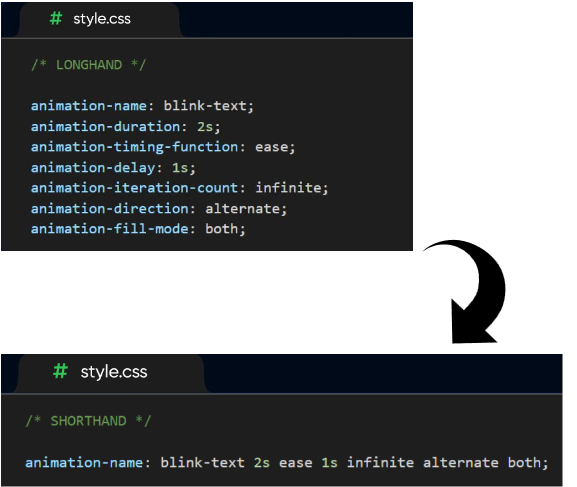
animation-delay: This is used by the developer to determine the delay between an element loading and the start of an animation sequence. That is to say, by this sub-property the developer decides whether the animation is going to start immediately or partway through the animation.
animation-direction: Here two things are going to be specified. First, the developer specified towards which direction an animation’s first iteration should move forward or backward. Moreover, they can make a choice between whether subsequent iterations should alternate direction on each run or reset to be back to the start point and repeat. It can get these values: -normal: Plays forward. -reverse: Plays backward. -alternate: Alternates between forward and backward. -alternate-reverse: Alternates, starting in reverse.
animation-duration: The developer specifies the length of time for completion of the animation’s one cycle.
animation-fill-mode: With this sub-property the way that the animation applies style to its target before and after it runs is specified. It can get these values: -none: The element doesn’t retain animation styles. -forwards: Keeps the styles from the last keyframe. -backwards: Applies the styles from the first keyframe during the delay. -both: Combines forwards and backwards.
animation-iteration-count: The number of time that an animation should repeat is determined by this sub-property. It can get these values: -1, 2, etc.: A specific number of repetitions. -infinite: Loops indefinitely.
animation-name: This one is used to specify the name of the @keyframe at-rule describing an animation’s keyframes.
animation-play-state: The developer is offered the chance to determine whether an animation sequence should pause or play.
animation-timeline: The progress of a CSS animation has a timeline which is controlled by this sub-property.
animation-timing-function: The developer specifies how an animation transitions through keyframes by establishing acceleration curves. It can get these values: -linear: Constant speed. -ease: Slow start, faster middle, and slow end. -ease-in: Slow start, then accelerates. -ease-out: Starts fast, then decelerates. -ease-in-out: Combines ease-in and ease-out. -cubic-bezier (): Custom easing curve.
Using the animation shorthand is a good way of saving space. Some of the sub-properties that I just explained can be replaced by using the shorthand form.
Keyframes
Keyframe animations give the developer control and flexibility. That is to say, keyframes enable the developer to specify the intermediate stages of animation, while applying more complex timing functions. So, after configuring the animation’s timing using animation property, now it is the time to define the appearance of the animation. In order to do so, the developer needs to establish one or more keyframes. Each keyframe is used to describe the way the animated element should appear at a given time during the animation sequence. In other words, keyframes define specific points during an animation where style changes occur. These keyframes work in conjunction with animation property. While the animation property controls how the animation is applied to an element, each keyframe specifies a snapshot of an element’s properties at a particular percentage of the animation’s duration. So, these snapshots created using keyframes make the animation to create smooth and dynamic effects by guiding the animation’s progression. Keyframe has these sub-properties:
Transform: Transform properties allow you to move, scale, rotate, or skew elements.
Opacity: Controls the transparency of the element. -opacity: 0; /* Fully transparent / -opacity: 1; / Fully visible */
Color Properties: Animate color transitions for text, backgrounds, and borders.
Position and Size: Animate dimensions and positioning. -width / height -margin / padding
Border and Outline: Animate border and outline properties. -border-width -border-radius
Box Shadow Text Properties: Animate styles related to text. -font-size -font-weight -letter-spacing -line-height -text-shadow
Bear in mind that CSS is parsed by the browser from top to bottom. The browser processes rules in the order they appear. That is why at first the developer needs to define the keyframe. The next step is assigning the animation to an element using the animation property. If the browser encounters an animation property without a corresponding @keyframes definition earlier in the stylesheet, it won’t know how to handle the animation.
CSS Animation VS CSS Transition
Transitions provide a change from one state to another, while animations can set multiple points of transition upon different keyframes. Animations within CSS3 allow the appearance and behavior of an element to be altered in multiple keyframes. Transition is used to create smooth animations to interpolate between the initial and the target state of a specific element. On the other hand, CSS animations are more powerful and flexible. While transitions are simple and rely on property changes, animations give the developer extensive control over timing, iterations, and playbacks. So, CSS animations are ideal for having more dynamic and intricate designs.
Conclusion
CSS animations are an essential and useful tool in web development that offers a wide range of capabilities to developers to create visually engaging and interactive experiences. From simple transitions to complex keyframe animations, CSS empowers crafting animations that enhance user interfaces without compromising performance.
In terms of the design of my project ,I want to begin with my choice of colours. I used pale colours for the entire website because I wanted to keep my soft and friendly tone. For the body I used the colour #efe3cb which is a yellowish colour, my thought behind this choice of colour is that whenever you think about cheese the first colours that come to your mind are yellow and cream/white. So, I combined yellow and white and came up with a pale yellow colour for the body. Moreover, to have a contrast between my body and my contents container I used a more creamy colour for div elements. In addition to that, I used the colour #8BAA94 that represents freshness and nature because I wanted to reflect the organic farm connection. I used this greenish colour for the website’s navigation bar as well as the box shadows that some elements such as headings and img (Our Team) have. Last but not least, my texts have a dark brownish colour which in my opinion adds warmth and authenticity. Talking about my choice of font, I chose “Kurale” Which is a cursive font to some extent for my heading, it adds more softness to my designs. Then, I have “Playpen Sans” for the other text elements. This font is a similar font to the font that I chose for my headings so the harmony is maintained. Also, this is a website for a small business not a brand or a big company so I chose to have a friendly tone throughout the website which affected my choice of colours as well as fonts. That is another reason why I chose these two fonts that are easily readable and entertaining at the same time. In terms of the visual experience, there are again two images one a woman making hand-made cheeses and the other a cheese shop on the first page to help build a strong story about the business. The images that I chose for the team members are all taken in a farm to again create this feeling for the costumers that all the products are organic and hand-made by the family members. Also, I gave these photos a border radius of 50% to have circle photos which look like profile pictures. I started my designing for the mobile responsive mode first, that is why I only had to add a few media queries to just control the font size and the width of my contents containers as the viewport gets wider. Having said that, I decided to use grids for my footer when the view port gets wider than 800px, if I did not add the grids there would be a lot of empty space in the footer.
First and foremost I need to state my topic. I have chosen to create a website consists of the stories behind Persian festivals. Persian festivals are reflections of history filled with vibrant traditions, stories, and rituals. My target audience is mostly young users looking for something entertaining and fun. So, the stories that Iam going to present will offer an exciting opportunity to my target audience to be able to connect with history and be entertained while learning about the ancient cultural significance of Nowruz, Mehregan, Yalda, and other festivals. Having said that, Iam totally aware that achieving those goals requires a well-thought user experience design that is able to capture the users’ attention and interest, as well as making the process fun and interactive at the same time.
In this article, how I am going to create a suitable UX for my project exploring the stories behind Persian festivals, based on the workshops that I attended. I will talk about my design strategies and interactive features. In addition to that, I will present some personas tailored to young audiences, ensuring my website to be able to become both educational and entertaining.
More On Target Audience
It worth considering that as time pass by young audiences started to bring specific preferences to digital interactions, this behaviour is mostly influenced by their excessive exposure to modern technologies and entertainment platforms, from social media to online games. Since I want to create a website for this age group I need to have a thorough understanding of their needs and expectations. Key characteristics of my target audience Tech-savvy Users: I need to take into consideration that this generation is highly familiar with smartphones, iPads, tablets, and applications. That is why they expect sleek design and intuitive interfaces. Visual and interactive learners: My target users are mostly drawn to engaging visuals, animations, and hands-on activities rather than static, text-heavy content. This is one of the reasons that I want to focus on animating my elements on the website. Short attention spans: Young people may found it harder to focus, as they easily get distracted naturally. So, the content needs to be both concise and dynamic at the same time to have the potential to sustain their interest. Explorative behaviour: My target audience enjoys exploring, experimenting, and discovering new things.
Put it into a nutshell, this audience is at a formative age where storytelling and interactive experiences can leave a lasting impact on them. That is to say, a well designed UX can spark curiosity about Persian culture, also encourage them to have a sense of connection to these traditions which were also celebrated by first civilized human beings. To achieve this, first I need to think about real people as it was mentioned in the workshop one of the key features of user research is try to figure out people’s relationship to products and services in real contexts. Considering my users’ needs, behaviors, motivations, triggers, and barriers is the first step to take in this journey.
Leveraging Visual Experience
In order to earn the engagement of young audiences I am planning to use visual illustration which is a powerful tool for achieving my goal. I can make the stories behind Persian festivals more accessible and captivating by using visually dynamic formats alongside narratives. To begin with, using CSS animation will help me to create colorful, Persian-inspired illustrations. To be more specific I plan to use motifs such as pomegranates for Yalda night, fire for Chaharshanbe Souri, Haft-sin for Nowroz to reinforce cultural themes. There are two key points that I want to pay attention to. First I need to keep those visuals vibrant and culturally authentic, to make sure that the visuals that I have created are reflecting Persian design aesthetics. After that, I want to make sure that I am using motion graphics to guide attention and emphasize key storytelling moments. Building Emotional Connections Moving on to my next method, I am totally aware of the fact that young users are more likely to engage with content that they feel an emotional connection to it, no matter how less it is. That is why I have to use some techniques in order to try to create that connection. First technique could be presenting relatable anecdotes or short stories about people celebrating Persian festivals, like how families help each other to decorate Haft-Sin or how grandparents tell Yalda tales. In addition to that, character driven narratives that includes fictional characters guiding users through narrating stories and explaining traditions. Inclusive and Accessible Design Since I want to be sure that my platform will have the potential to reach a broad audience, I need to prioritise both inclusivity as well as accessibility. In order to do so, I am planning to offer the platform in both English and Persian to cater to diverse users. On top of that, I want to include narrated versions of text-based content for users who prefer listening or those who are dealing with reading difficulties. Moreover, designing the interface of the website with large, easy-to-click buttons and a straightforward layout which is also known as simple navigation are necessary to ensure the usability of my platform. In terms of the design of the website, I want to use high-contrast color schemes for readability, especially for visually impaired users. Lastly, I want to include a simple search bar that has some predictive text to help users find specific festivals or stories quickly. Multimedia Integration As I mentioned previously in this article multimedia elements are required for creating an immersive experience. Including short videos in the website to show how local people celebrate Persian festivals can be helpful. In addition to that, In my opinion using traditional Persian music to set the tone of different festivals, such as celebrating tone for Nowroz or some calming melodies for Yalda night could be another thing that might make my website to be more interesting. Adding clickable sound effect such as the crackling of a Chaharshanbe Souri fire could also be fun for my users.
Core UX Design Principles
Designing for this demographic requires balancing education and entertaining. As I mentioned in the previous paragraphs, one of the goals of user research is to figure out the relationship between people and products/services in a real context. After considering users’ needs now it is time to think about my product promise/value proposition. That is to focus on what is my services promise and to what extent it is going to meet that promises. My website promises an interactive platform in which you are able to feel a connection with ancient festivals as well as learning about history, and be entertained through visual elements.
My challenge here is to be sure that I will be able to create a platform that is going to be successful in meeting these promises, by doing a thorough user research, consider all the details, and have a comprehensive understanding of the behaviors and expectations of my target audience. In my opinion, trying to come up with some imaginative assumptions and hypotheses will help me to prevent some challenges at the very beginning. The other thing that I want to prevent is biases. Me being a Persian might raise some issues that I might write my content with some biases. Having said that, I am just going to be a local person sharing my own personal experiences of celebrating these festivals. I also need to state that socializing with other people from other parts of the country, reading articles, watching interviews and videos also proved me that almost 95% of people in my home country celebrate these festivals in the way that I do. Here I want to talk about some tips for better user experience that were mentioned during the second workshop. First, I need to have this in my mind that I am not the user, my users are going to be young people mostly aged 10-17, so I will approach with design strategies based on this age group needs and expectations not mine. Second one is asking why questions, I need to always dig dipper than what I see on the surface, all the details need to be considered and well-thought. Validating my assumptions is another point here. Testing everything early and often is the key to success because without validating all of the design ideas that I have in my mind are just assumptions. Brainstorming on walls and starting on papers were the other two tips mentioned by Chris. While I am planning to use the walls of my room to write and sketch ideas to make them more visible, I am also going to try to let go of bad ideas as soon as it is possible and stick to good ideas to have more time in order to flourish those good ones. Having said that, it is important to bear in mind that having bad ideas is also necessary here, based on one of the activities that we did during the second workshop with Chris, it is good to first think about what is going to be the worst experience that I as the website creator can create? What would make my platform to be frustrating? Knowing the answers to these types of questions would help me to prevent many issues happening in the first place. Moving on to the next technique, it is worth spending time on my content requirements. In this step, having a table of what does my user want/need to do as well as what do I as the content creator want my users to do. Writing these statements will definitely shed light on the differences between my users’ expectations and my expectations. That is because as I mentioned previously, I must consider the fact that I am not the user. Lastly, throughout the two workshops I learned that continuous testing and refinement are key to create an engaging experience. That is why I need to test my website in order to make sure that my attempt has been successful, by conducting usability tests with users from the target demographic to identify pain points and areas for further improvements. Luckily, I have many cousins who are in the same age as my future target audiences and are excited to help me in this process.
Conclusion
Designing a website which has engaging user experience for my project that is the stories behind Persian festivals requires a very delicate balance between education and entertainment. I will be able to reach my goals by incorporating some techniques that I have mentioned in this article which are leveraging visual experiences, building emotional connections, and ensuring and inclusive and accessible design. This platform is going to be able to capture the curiosity and attention of my target audiences who are tech-savvy young generation. Simplifying navigation and personalising content could also ensure that my project is accessible, inclusive, and enjoyable at the same time.
Finally, my ultimate goal is to come up with a website that transforms the rich history and traditions of Persian festivals into a memorable and immersive experience. I want to develop a lifelong appreciation for Persian culture by earning the engagement of young users and inspire them to explore their heritage. A well-thought, iterative approach to UX will both captivate my target audience, and ensure that my project has a lasting impact on how these timeless Persian festivals and stories behind them are shared and celebrated in this digitalized era.
The font that is used for Wikipedia are Serif font: “Georgia” or “Times New Roman” (commonly used in headings and article titles) Sans-serif font: “Arial,” “Helvetica,” or the default sans-serif font on the device (used for interface elements, navigation, and information boxes). These fonts are all open sources, and since Wikipedia is a site in which you are supposed to read long texts Serif fonts increase the readability so my eyes easily go along lines and words and I find it quite easy to skim the text in this site. In addition to that, these fonts are available on all devices as default so there is not any issues in terms of the fonts accessibility.
“GDS Transport” font is used in the UK government site. This font is highly accessible to the point that it is considered to be suitable for people who suffer from dyslexia or other visual issues. That is why, there is not any need for an “easier to read” option for those people. In addition to that, when designing this font high legibility was considered to be a priority, so it is readable in extreme conditions such as at night or at high speed.
W3 schools website has also used “Verdana” which is a sans-serif font. This font is being supported on almost all devices from Windows server 2003 to Windows 11, so again accessibility has been considered here. Also, this font is designed to be easy to read at small sizes since it has wide, open letterforms and small curves. These all enable the user to be able to read the information easily.
Simple is a skin care brand that uses the colour green for packaging of their products as well as the dominant colour for designing their website. For many people, the color green means nature and brings to mind grass, trees, and forests. Green is often described as refreshing and tranquil. We Persians call the last month of winter Esfand which is the name of a plant because at this time spring and greenness returns to the earth. That is why choosing green for a skincare brand is considered to be a great choice.
Qatar Airways uses the exact same purple for their website as they have for their logo. Choosing the colour purple for an airline company is nothing but wise. Since purple is associated with royalty, luxury, and nobility, it gives people the notion that they can experience luxury flights with this airline.
This website is for a hospital for children. Blue and white are the two dominant colours used in this website. Blue symbolises positivity and anything related to that such as trust, loyalty, and peace. The usage of blue subconsciously affects the minds of the users and releases feelings of tranquility. In That is why blue is the greatest choice for health related websites.
This week our main concentration was on HTML. Having said that, the first thing that we have to keep in mind is the web standard model. So, a web consists of four layers. First layer is content which is our texts, images, videos, … . The second layer is structure which is the HTML. Next, we have presentation which is CSS. Last but not least, there is behavior which is JavaScript. As I said earlier we dived into the basics of this mark up language this week. By using HTML elements we are telling the browser how to display our content. The html element consists of two major elements: first head and second body. These two both have their own elements such as title which is the most important element in the head section. In the body section we have h1 to h6 for headings, p for paragraphs, and many more. There are tags for HTML images img which is considered to be a self-closing tag as well as tags for HTML links a. To go into more details, when we want to use an image we need its URL to be mentioned in src. We also need to mention an alternative text that describes the photo in a couple of words for screen readers in case of any troubles occurrence during page loading. For instance, alt=“a picture of a bird”. In case of links we need href which is the attribute for specifying the URL of the page the link goes. Moreover, I learned that understanding how to manage our files and folders is super important. That is to say, all of our folders need to have a meaningful name that gives us all the information of the file content. Also mentioning the correct source name is also a necessity if we have a text it needs to be “.txt”.
The purposes of HTML and CSS are completely different. HTML is for providing structure to documents and meaning to content, but CSS is for providing visual style to documents. That is to say, presentation has nothing to do with the way things show, we need to use CSS for that purpose. With CSS we have much greater control over formatting as well as improving accessibility. The first step in presentation layer is to reset the browser default styling. The most common reset codes is Eric Mayer’s. We need to keep in mind that a browser can only display the fonts specified in CSS rules if that font is available on the clients computer system fonts. That is why we should mention more that one font to make sure that all the users are able to see our suggested fonts. There are different types of selectors. This week we got to know three of them Grouping selectors, Universal selector, and Type selectors.
Design has 3 principles: balance, gradation and contrast, and repetition and rhythm. Our design needs to have a symmetric balance.
This silicon sleeve which is placed on my travel mug is absolutely amazing. It helps you to hold the mug without burning your fingers when there is hot drink poured in it, and it is also designed to have a place for your fingers to hold it easily. The texture of it which is silicon that is a durable material also makes it impossible for the travel mug to slip through your hands when your drink is spilled over the mug or when you are trying to wash it. The grooves that are designed are also another feature that is preventing the mug to slip through your hands. It is also placed on the top part of the mug so you can easily open its lid by moving your finger which is holding the mug to press the button and drink from it without having to move your hands to hold the mug in any different positions. Additionally, it is glued to the mug so it is fixed in its place. That is why this silicon sleeve is not loose and does not move from top part of the mug to the bottom part. Moreover, the texture of this silicon sleeve makes it to be washable.
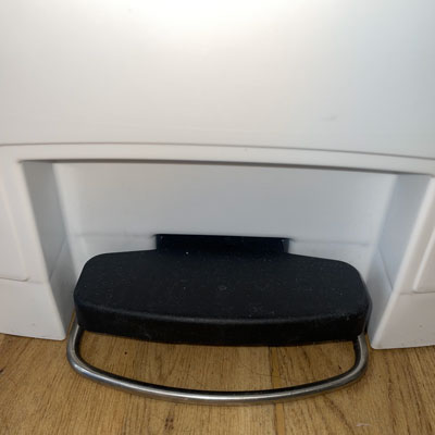
Foot Pedal
The foot pedal that is designed for my kitchen’s dustbin is one of the most useful things that I have ever seen in my entire life. These foot pedals were invented in 1920s by Lillian Moller Gilbreth who was an industrial engineer. So, it helps you to pour your litter into the dustbin without having to touch the lid of it. For example, most of the times you do not want to touch the lid of the dustbin because it makes your hands to become dirty. That is why these foot pedals ensure a hygienic experience, because in this way you are not in risk of any cross-contamination or germs. Also, there is another case when your hands are full and you are not able to use your hands in order to open the bin, this pedal solves this problem and you are able to pour your litter into the dustbin by just pressing the pedal using your foot. Although this type of dustbin which uses foot pedal is particularly recommended in public areas and commercial establishments where many individuals are in contact with the bin, in my opinion the use of no foot pedal dustbins should be eliminated for good.
Pepper Jar
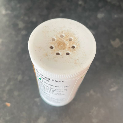
The number of holes on this pepper jar is just perfect. There are just seven tiny holes on the top of this pepper jar which prevent the pepper to be poured more than the amount that you want. The day that I bought this pepper jar from the grocery store I also bought a salt jar along side it. But, the salt jar doesn’t have any tiny holes on top of it instead it just has a big hole from which there is always a great amount of salt poured. So, I always need to pour a little bit of salt on my palm and pour it on my food using my fingers which is a frustrating work to do, and it causes a great amount of salt to be wasted. That made me think of how well designed this pepper jar is compared to that salt jar. There is not even a single grain of pepper wasted whenever I use this jar. Also, it is made of plastic so if I drop the jar on the floor there is not going to break like if it was made of glass. Last but not least, it is reusable so you can fill it whenever you run out of pepper.
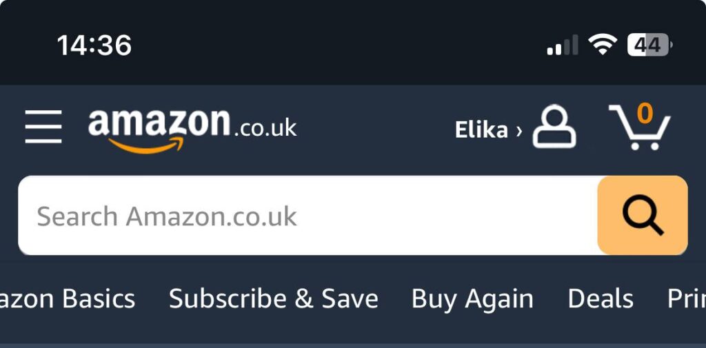
The amazon website is absolutely well designed. The hamburger menu which is a form of navigation menu that hides navigation links from the main page is placed on the top left side of the site and it directs users to the pages that they desire to visit. From trending products to all the different departments of products. Also, whenever you open the website first you can see the recommended products with amazing deals which are based on your previous searched ones. Right on top you can search what products you wish to purchase and find hundreds of different models from different brands. Additionally, the purchase basket placed on top of the web page makes it easier for users to figure out how many products have they added. One of the other best features is that when you click on a link in this website there is not a new tab opening so you are not facing dozens of tabs when you are surfing this website.
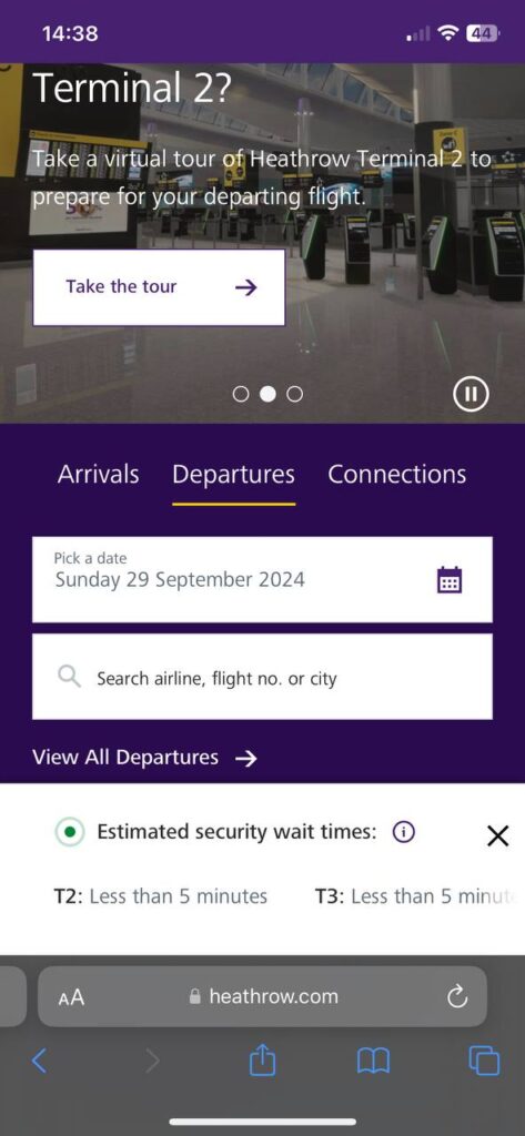
The first thing that caught my attention when I opened the Heathrow Airport website was a white box which is placed on the bottom part and does not vanish when scrolling. This box is designed to give you information about estimated security wait times in different terminals. Having this information is very helpful as a traveler. In addition to thar, you are provided with this chance to choose whether you want to check arrival, departures or connection flights. The key point here is that it doesn’t bombard you with a massive amount of information related to all flights but rather first gives you the opportunity to search a specific date and a flight number, and if you wish to see all flights only then you can easily have access to that by clicking on View All section. Moreover, you this website is all you need for receiving any services that they provide from parking to fast track security. So, you do not need to be directed to any other websites in order to book those services. Last but not least, the virtual tour of the airport that is accessible for all the passengers on the website is going to help you to know where should you go and it prevents the possibility of getting lost and wasting your time.
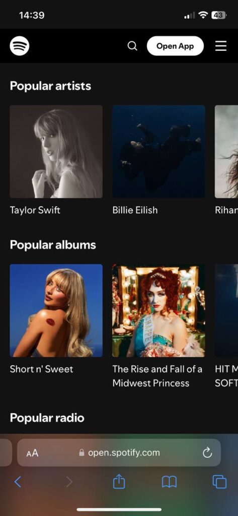
When you open this website you figure out that unlike most of other sites that have a light mode Spotify has a dark mode which is in my opinion the best choice for a music platform. Additionally, unlike the other two websites which I mentioned in my previous posts, the logo is placed on the top left side and the hamburger menu is placed on the top right side. On the first page there are multiple collections from popular artists to popular albums which make it easier for users to find hit songs. The last collection is made up of several pre-made playlists with a wide range of artists and songs. Moreover, one of the best features of this website is that it allows you to listen to a part of the songs that you want to listen without having to sign up or log in into your account. Also, you can be easily directed to the home page by clicking on the logo. Finally, when you wish to only find songs or only artists when you are searching there is a bar right under the search box so you can easily choose a filter and have access to exactly what you want.