Article on CSS Animation
CSS Animation
Introduction
CSS animation is a cornerstone of modern web design, by giving a golden opportunity to developers to create dynamic and engaging user experiences. CSS animations are used to create a visual animation effect since they allow the developer to animate some properties of an element, such as its position, width, height or color over a specified period. That is to say, the developer is able to make HTML elements to transition smoothly, move, and interact in response to a specific user action or a predefined event—all without writing even one line of JavaScript code. CSS animation provides the tool to craft a subtle hover effect, a looping animation, or an intricate sequence of movements.
This article aims to explore CSS animation in depth by covering its fundamental principles as well as some real-world application. Hopefully, by the end of this article the reader will have the required knowledge to bring their web projects to life using CSS animations.
What is CSS Animation?
As I mentioned in the previous paragraph CSS animation has to do with the process of animating HTML elements using CSS properties. It is worth mentioning that CSS animation unlike JavaScript or other external libraries, are lightweight, easy to implement, and optimized for performance at the same time.
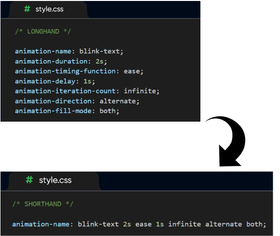
Configuring an animation
In order to create a CSS animation sequence, the developer needs to style the element that they want to animate using the animation property. This lets the developer to have control over duration, timing, and all the other details related to how the animation process should progress. Having said that, it needs to be taken into consideration that the configuration of the actual appearance of the animation is done using @keyframes at-rule which will be discussed in the article later on. The Animation property that we mentioned earlier has some sub-properties:
- animation-composition: composite operation in CSS is used to combine an effect value with an underlying value. There are 3 types of composite operations:
- Replace: In this case the effect value will replace the underlying value.
- Add: The effect value is added to the underlying value.
- Accumulate: This one is used to combine the effect value with the underlying one.
So, this animation-composition determines which one of the three composite operations to use when there are multiple animations affect the same property at the same time. Having said that, this property is not used as a part of the animation shorthand form. - animation-delay: This is used by the developer to determine the delay between an element loading and the start of an animation sequence. That is to say, by this sub-property the developer decides whether the animation is going to start immediately or partway through the animation.
- animation-direction: Here two things are going to be specified. First, the developer specified towards which direction an animation’s first iteration should move forward or backward. Moreover, they can make a choice between whether subsequent iterations should alternate direction on each run or reset to be back to the start point and repeat. It can get these values:
-normal: Plays forward.
-reverse: Plays backward.
-alternate: Alternates between forward and backward.
-alternate-reverse: Alternates, starting in reverse. - animation-duration: The developer specifies the length of time for completion of the animation’s one cycle.
- animation-fill-mode: With this sub-property the way that the animation applies style to its target before and after it runs is specified. It can get these values:
-none: The element doesn’t retain animation styles.
-forwards: Keeps the styles from the last keyframe.
-backwards: Applies the styles from the first keyframe during the delay.
-both: Combines forwards and backwards. - animation-iteration-count: The number of time that an animation should repeat is determined by this sub-property. It can get these values:
-1, 2, etc.: A specific number of repetitions.
-infinite: Loops indefinitely. - animation-name: This one is used to specify the name of the @keyframe at-rule describing an animation’s keyframes.
- animation-play-state: The developer is offered the chance to determine whether an animation sequence should pause or play.
- animation-timeline: The progress of a CSS animation has a timeline which is controlled by this sub-property.
- animation-timing-function: The developer specifies how an animation transitions through keyframes by establishing acceleration curves. It can get these values:
-linear: Constant speed.
-ease: Slow start, faster middle, and slow end.
-ease-in: Slow start, then accelerates.
-ease-out: Starts fast, then decelerates.
-ease-in-out: Combines ease-in and ease-out.
-cubic-bezier (): Custom easing curve.
Using the animation shorthand is a good way of saving space. Some of the sub-properties that I just explained can be replaced by using the shorthand form.
Keyframes
Keyframe animations give the developer control and flexibility. That is to say, keyframes enable the developer to specify the intermediate stages of animation, while applying more complex timing functions. So, after configuring the animation’s timing using animation property, now it is the time to define the appearance of the animation. In order to do so, the developer needs to establish one or more keyframes. Each keyframe is used to describe the way the animated element should appear at a given time during the animation sequence. In other words, keyframes define specific points during an animation where style changes occur. These keyframes work in conjunction with animation property. While the animation property controls how the animation is applied to an element, each keyframe specifies a snapshot of an element’s properties at a particular percentage of the animation’s duration. So, these snapshots created using keyframes make the animation to create smooth and dynamic effects by guiding the animation’s progression. Keyframe has these sub-properties:
- Transform: Transform properties allow you to move, scale, rotate, or skew elements.
- Opacity: Controls the transparency of the element.
-opacity: 0; /* Fully transparent / -opacity: 1; / Fully visible */ - Color Properties: Animate color transitions for text, backgrounds, and borders.
- Position and Size: Animate dimensions and positioning.
-width / height
-margin / padding - Border and Outline: Animate border and outline properties.
-border-width
-border-radius - Box Shadow
Text Properties: Animate styles related to text.
-font-size
-font-weight
-letter-spacing
-line-height
-text-shadow - Background: Animate background effects.
-background-position
-background-size
-background-image - Visibility: Animate the visibility of an element.
-visibility
Example: visibility: hidden; - Filter Effects: Animate visual effects on elements.
-filter
Example:
filter: blur(5px);
filter: brightness(0.8); - Clip: Animate clipping.
-clip-path
Bear in mind that CSS is parsed by the browser from top to bottom. The browser processes rules in the order they appear. That is why at first the developer needs to define the keyframe. The next step is assigning the animation to an element using the animation property. If the browser encounters an animation property without a corresponding @keyframes definition earlier in the stylesheet, it won’t know how to handle the animation.
CSS Animation VS CSS Transition
Transitions provide a change from one state to another, while animations can set multiple points of transition upon different keyframes. Animations within CSS3 allow the appearance and behavior of an element to be altered in multiple keyframes. Transition is used to create smooth animations to interpolate between the initial and the target state of a specific element. On the other hand, CSS animations are more powerful and flexible. While transitions are simple and rely on property changes, animations give the developer extensive control over timing, iterations, and playbacks. So, CSS animations are ideal for having more dynamic and intricate designs.
Conclusion
CSS animations are an essential and useful tool in web development that offers a wide range of capabilities to developers to create visually engaging and interactive experiences. From simple transitions to complex keyframe animations, CSS empowers crafting animations that enhance user interfaces without compromising performance.
My presentation slides
References:
https://developer.mozilla.org/en-US/docs/Glossary/Composite_operation
https://codedamn.com/news/css/advanced-css-animations-transition-keyframe
https://developer.mozilla.org/en-US/docs/Web/CSS/@keyframes#